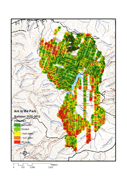
This is the uptake noted at the second (October - November) and third (February - early April) baitings. Comparing this with the previous map, a clear benefit can be seen from the large areas where red has been replaced with green. The red internal (ie not border areas where invasion is expected) 'hotspots' are of concern if they represent surviving populations from 2011, but could alternatively be recent new populations. Comparison of sequential maps is required to make this distinction, and to detect persisting populations. See next map, showing uptake from April 2012 only.